

Filters
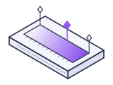
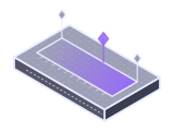
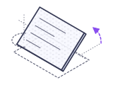
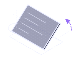
The same card through grayscale, sepia, invert and blur. One class each, no image editing.
Monsoon is utility-first CSS in one file from a CDN. Every class is already written, a whole theme grows from one --seed color, dark mode is automatic and 167 components run on native HTML with no JavaScript.
$npm i monsooncss

Live editor
The editor is plain HTML with Monsoon classes. The preview loads the same stylesheet you would link in production and updates on every keystroke.
Responsive design
Mobile first breakpoints for the viewport, container queries for components. Drag the handle or pick a preset: the prefixes that apply at the current width light up in the code.
<div class="mx-auto max-w-5xl p-4 sm:p-6">
  <header class="flex flex-col sm:flex-row sm:items-center justify-between gap-3">
    <div>
      <p class="text-xs font-semibold uppercase tracking-widest text-primary">Monsoon weather</p>
      <h1 class="text-xl md:text-2xl lg:text-3xl font-bold tracking-tight">Rain this week</h1>
    </div>
    <nav class="hidden md:flex gap-1 text-sm">
      <a class="rounded-lg bg-primary text-primary-foreground px-3 py-1.5" href="#">Week</a>
      <a class="rounded-lg px-3 py-1.5 text-muted-foreground" href="#">Month</a>
    </nav>
  </header>
  <div class="mt-4 grid grid-cols-1 sm:grid-cols-2 lg:grid-cols-4 gap-3">
    <div class="rounded-xl border bg-surface p-4"><p class="text-sm text-muted-foreground">Lisbon</p><p class="text-2xl font-bold">18°</p><p class="text-xs text-primary">Light rain</p></div>
    <div class="rounded-xl border bg-surface p-4"><p class="text-sm text-muted-foreground">Mumbai</p><p class="text-2xl font-bold">29°</p><p class="text-xs text-primary">Monsoon</p></div>
    <div class="rounded-xl border bg-surface p-4"><p class="text-sm text-muted-foreground">Recife</p><p class="text-2xl font-bold">26°</p><p class="text-xs text-primary">Showers</p></div>
    <div class="rounded-xl border bg-surface p-4"><p class="text-sm text-muted-foreground">Oslo</p><p class="text-2xl font-bold">9°</p><p class="text-xs text-primary">Drizzle</p></div>
  </div>
  <div class="@container mt-4 rounded-xl border bg-surface p-4" data-cq>
    <div class="flex flex-col @md:flex-row @md:items-center gap-4">
      <div class="h-20 @md:w-40 shrink-0 rounded-lg bg-gradient-to-br from-primary to-accent"></div>
      <div>
        <p class="font-semibold @lg:text-lg">Umbrella index</p>
        <p class="text-sm text-muted-foreground">This card reads its own width. It stacks below 28rem and turns into a row above it, wherever you put it.</p>
      </div>
    </div>
  </div>
</div>How it works
Nothing scans your markup at build time. Type a class and see the rule it maps to in the stylesheet you linked; switch to the terminal for the optional purge step.
Rendered
Edit the class list. Every class is looked up in the real stylesheet, including variants and component classes.
monsoon.min.css, the rules your classes useGenerated CSS, already in the file you linked
/* loading the class index */
$ npx monsooncss purge "src/**/*.html" -o public/monsoon.css
monsooncss purge: scanned 1 file
  kept 294 of 16351 utility rules
  public/monsoon.css: 281.2 kB raw, 48.4 kB gzip, 39.2 kB brotli (full build 88.0 kB brotli)
done in 4.0 s, size report included
Everything in one file
Each card is a live demo built with the classes it describes.
The same card through grayscale, sepia, invert and blur. One class each, no image editing.
Mo Panda
Umbrella engineer
One element tree, two schemes. Drag the divider: the right half only adds class="dark".
:root {
  --seed: #3b5bdb;        /* the only line you write */
}
/* derived in the browser */
--primary: oklch(from var(--seed) ...);
--accent:  oklch(from var(--seed) l c calc(h + 180));
--surface: oklch(from var(--seed) 1 min(c, .008) h);Every token is a custom property derived from --seed. Override one, or all, at any level.
22 hues by 11 steps on one perceptual lightness curve, so step 500 of every hue carries the same weight.
grid-cols-4 grid-rows-3 col-span-2 row-span-2
Columns, rows and spans compose a mosaic without a single line of custom CSS.
ease-linearease-outease-in-outease-inLinear, ease out, ease in out and ease in, with durations and delays for every interaction.
@layer base {
  /* reset and element defaults */
  h1, p, ul { margin: 0; }
}

/* your rules sit outside the layer,
   so they win without !important */
h1 { letter-spacing: -0.02em; }The reset lives in @layer base, so your own CSS overrides it with no specificity games.
dir="ltr"
Hello, Mo
border-s-4 ps-3
dir="rtl"
مرحبا
border-s-4 ps-3
Start and end instead of left and right. The same classes flip for right to left languages.
<div class="@container">
  <article class="flex flex-col @sm:flex-row gap-4">
    <img class="@sm:w-1/3" src="cover.jpg" alt="">
    <p class="@md:text-lg">Fits any column.</p>
  </article>
</div>Mark a parent with @container and style children by its width, from @xs: to @xl:.
From, via and to stops with every palette color and the semantic tokens.
Hover me
rotate, scale, translate
group-hover:rotate-6 group-hover:scale-105
Rotate, scale and translate with hover and group hover variants. Hover the stack.
Light dismiss and top layer, no script.
Opens with Enter or Space, announced by screen readers.
Dialog, popover and details styled by Monsoon and powered by the browser. They really work.
--seed: #3b5bdb
Pick a color and watch a dashboard re-theme itself, contrast safe, in pure CSS.
Theming with one color
Buttons, cards, charts and tables re-theme live in light and dark mode. Contrast ratios are measured from what your browser actually paints.
Light
Visitors
24.8k
+8.1%
Signups
1,204
+3.4%
Revenue
$9.3k
this week
| Customer | Plan | Status |
|---|---|---|
| Ada Rivers | Team | Active |
| Kai Moreno | Starter | Trial |
Dark
Visitors
24.8k
+8.1%
Signups
1,204
+3.4%
Revenue
$9.3k
this week
| Customer | Plan | Status |
|---|---|---|
| Ada Rivers | Team | Active |
| Kai Moreno | Starter | Trial |
Ratios are WCAG 2 contrast measured from the colors your browser renders. The test suite checks 4.5:1 or better for every pair in both modes.
Dark mode
Monsoon follows the operating system by default. Add class="dark" or class="light" to the root or to any section and every semantic color inside follows: backgrounds, text, borders and the focus ring.
<html data-theme="dark">

<!-- or one section only -->
<section class="dark">
  <div class="bg-surface text-foreground">Always dark</div>
</section>Inbox
3 newForecast updated
Heavy rain expected after 6 pm.
Mo shared a palette
Storm blue, cyan, violet and rose.
Why Monsoon
No build in production, arbitrary values without one, a theme from one color, tested contrast and native components. Every reason has a live demo.
One stylesheet link is the whole install: every class is already in the file, 88.3 kB with brotli, so there is no compiler, config or watcher, in development or in production.
02Write w-[37px] or bg-[#0ea5e9] when no step fits: a small script writes the rules in the browser, or the purge CLI compiles them for production.
03Primary, accent, surfaces, borders, muted text and the focus ring are computed from one OKLCH seed in pure CSS, so one line re-themes everything.
04Every fill and its foreground keep at least 4.5:1 for any seed, in light and dark mode, and the test suite checks each pair across a sweep of seeds.
05Put a seed on any element and only that subtree re-themes, so a pricing card, a sidebar or a whole tenant can have its own brand on the same page.
06A light card inside a dark section inside a light page is exactly what you expect, at any depth, for the tokens and for the dark: prefix alike.
07167 components ship in the one stylesheet, 122 of them with no script at all: forms, actions, navigation, overlays and data display.
08Dialogs, popovers, menus and accordions are built on dialog, the popover attribute and details, so the browser does the work and nothing has to hydrate.
09One script adds file drop, cropping, date pickers, sortable lists, comboboxes and more on top of native inputs that keep working without it.
10Prefix a class with @sm: to @xl: and it reacts to the width of its container, so a card adapts to the column it is dropped into.
11text-fluid-* and p-fluid-* grow smoothly with the viewport between a mobile and a desktop size, with no breakpoint classes and respecting browser zoom.
12Hide navigation when printing, mirror a margin in right to left languages and fix a border for high contrast themes, all with a prefix.
13One command keeps only the classes your files use and writes static rules for every arbitrary value it finds, with no config file.
14It is plain CSS classes, so server templates, static site generators and single page apps all use it the same way, with 17 step by step install guides.
15Inputs, selects and buttons of the same size share one height, radius and padding token, so a row of mixed controls lines up with no tweaks.
16Twenty-two hues share one lightness curve and have their chroma capped to sRGB, so step 500 of every hue looks equally strong and renders the same everywhere.
17Every component has a visible focus ring, motion stops under prefers-reduced-motion and controls stay usable in forced colors mode, with no extra classes.
18Components sit before the utilities in the same file, so a utility on a component always wins without !important or a specificity fight.
19Every page of every site that links the same version shares one file the browser already has, so the second page and the next project load no CSS at all.
20classes.json lists all 4,923 classes with their CSS and variants, ready for editor completion, linters and other tooling.
npx monsooncss purge "src/**/*.{html,jsx,vue}" -o public/monsoon.cssmonsooncss purge: scanned 1 file
kept 294 of 16351 utility rules
public/monsoon.css: 281.2 kB raw, 48.4 kB gzip, 39.2 kB brotli (full build 88.0 kB brotli)
done in 4.0 s, size report included167 components
Forms, actions, navigation, overlays and data display. Every one is a class on native HTML, follows the seed and both schemes, and gives way to utilities.
Showcase
Full templates built with the stylesheet and nothing else. Open one, resize it, switch your theme, then read the source.
Utilities
Each category has a page with every class, the exact CSS it writes, its variants and a live example.
Guides
FAQ
Add one tag, <link rel="stylesheet" href="https://cdn.jsdelivr.net/npm/monsooncss">, and write classes such as px-4, md:grid-cols-3 or hover:bg-primary in your HTML. Every class is already in the file, so there is no compiler, no config file and no watcher to run.
Yes. The file is cached by the browser after the first visit, and you can pin an exact version such as monsooncss@0.2.0. If you want a smaller file, run npx monsooncss purge once and serve the result yourself.
Set --seed to any CSS color, for example :root { --seed: #0d9488; }. Monsoon derives primary, secondary, accent, surfaces, muted text, borders and the focus ring from it with OKLCH relative colors, in pure CSS. Put style="--seed: teal" on any element to theme only that section.
It is automatic. Monsoon follows prefers-color-scheme, and you can force a scheme with class="dark", class="light" or data-theme="dark" on the root element or on any section. Semantic colors such as bg-surface and text-foreground switch on their own, so most pages need no dark: classes at all.
No. Dialogs use the native dialog element, menus and popovers use the popover attribute or details, toggles are real checkboxes. Everything is CSS on top of native HTML, so it works in any stack.
The seed formulas push the primary color out of the lightness band where neither white nor dark text is safe, and flip the foreground to match. The test suite checks 4.5:1 (WCAG AA) for every token pair across named seeds and a sweep of sRGB seeds, in light and dark mode.
Stacked variants on static classes such as dark:hover:bg-muted and the important modifier are not part of a prebuilt stylesheet. Arbitrary values such as w-[37px] work with the optional monsoon.js script or the purge CLI, stacked variants included. For anything else, a style attribute or a few lines of your own CSS next to Monsoon work fine.
Free and open source under the MIT license.
<link rel="stylesheet" href="https://cdn.jsdelivr.net/npm/monsooncss">