To build a font from SVG files, prepare each letter as a clean filled path on a consistent artboard, import the SVGs into a font editor, align them to the baseline and metrics, set spacing, and export. In fontsketch this happens in the browser: you import SVG files or paste paths, tidy the outlines and export TTF, OTF, WOFF or WOFF2.
Why SVG is a great starting point
If you already design lettering in a vector app, SVG is the most direct route into a font. The paths are already curves, so nothing needs to be traced and no detail is lost. A font outline and an SVG path are close relatives: both describe shapes with lines and bezier curves. The main differences are the coordinate system and a few rules about what a font can contain.
Prepare your SVG files properly
Most problems with SVG to font conversion come from the source files. Spend ten minutes here and save an hour later.
Only filled shapes survive
A font glyph is a set of closed, filled contours. There is no such thing as a stroke width inside a font. If your letter is drawn as a path with a stroke and no fill, the font sees a zero width line and the letter vanishes or turns into a hairline. In your vector editor, use the command that converts strokes to outlines (often called outline stroke or stroke to path) before exporting.
The same applies to live text: convert it to outlines first.
Remove things fonts ignore
- Gradients, colors and opacity: fonts are single color, so all of this is dropped.
- Clipping masks: the hidden parts may come back. Apply the mask as a real shape operation instead.
- Hidden layers and guides: delete them from the export.
- Embedded images: a raster inside an SVG is not a vector. Trace it or redraw it.
Flatten transforms
Vector apps often store rotation, scaling or nested groups as transforms. Flattening them (sometimes called expand or apply transforms) gives you plain coordinates and avoids surprises.
Use compound paths for counters
Letters like o, a, e, B and R have holes, which type designers call counters. In SVG, make sure the outer shape and the hole are part of the same compound path, not two separate stacked shapes with a white fill on top. A white shape on top of a black one looks right in the vector app but becomes two solid blobs in a font.
Set up a consistent artboard
Fonts measure everything in units per em, and fontsketch uses 1000. Life gets easier if your SVGs follow the same logic:
- Create an artboard 1000 units tall for each letter, or one shared template.
- Decide where the baseline is (for example 800 units from the top, leaving 200 for descenders).
- Draw every letter so it sits on that baseline.
- Keep x-height and cap height lines as guides in the template.
The key is consistency. If one letter is exported from a 500 pixel artboard and another from a 1200 pixel artboard, they arrive at different scales.
Export settings in your vector app
Vector apps offer several SVG export options. These choices keep files clean and predictable for font import:
- Export each letter as its own file, or one artboard per letter, rather than a whole alphabet in one SVG.
- Use presentation attributes or inline styles rather than external stylesheets, so the file stands alone.
- Keep a reasonable decimal precision, two or three decimal places. More digits add file size without visible benefit.
- Avoid responsive or percentage based sizing. A fixed viewBox with known dimensions makes scaling consistent.
- Name files after the character, for example
a.svg,A_upper.svgorzero.svg, so you can find the right file when importing. Remember that some systems treat a.svg and A.svg as the same file name.
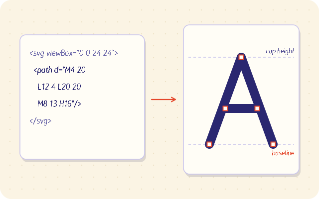
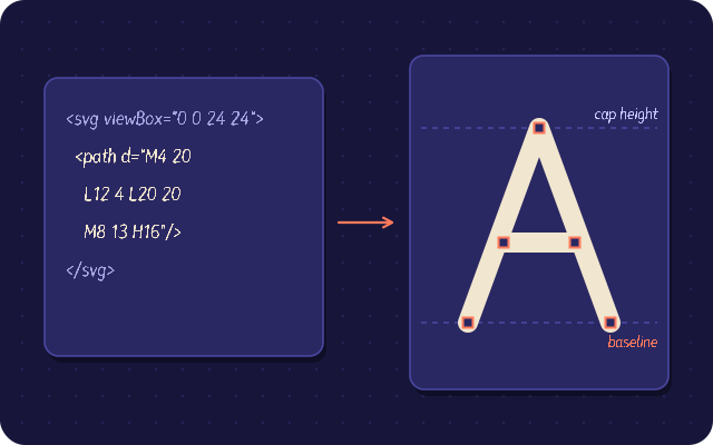
Open one exported file in a text editor and look at it. A clean letter is usually a single path element with a d attribute, maybe two or three for letters with separate parts like i or j. If you see groups nested five levels deep, transforms, masks or embedded images, go back and simplify.
Import the SVGs into fontsketch
Open the fontsketch editor and select the character you want to fill. Import the SVG file for that letter, or paste the SVG path data directly. The outline becomes an editable glyph, with all the drawing tools available.
After import, check each glyph against the metric lines:
- Does it sit exactly on the baseline?
- Do lowercase letters reach the x-height?
- Do capitals reach the cap height?
- Do round letters like o and c overshoot slightly, by about 10 to 15 units?
If a whole set of letters is consistently off, fix the template and re-export rather than nudging each glyph.
Clean up the outlines
Even good SVG files benefit from a quick pass:
- Overlap removal merges shapes that cross, such as the bar of a t over its stem. Overlapping contours can render with odd artifacts at small sizes and inflate file size.
- Contour direction correction makes sure outer contours and counters wind in opposite directions, so holes stay holes.
- Simplify reduces the number of points. Vector apps sometimes export dozens of redundant nodes; fewer points give smoother curves and better hinting.
Spacing, accents and kerning
SVG files do not carry spacing information, so you set it in fontsketch. Adjust the left and right side bearings until a test string such as Hamburgefonstiv reads evenly. Then add kerning pairs for the combinations that still look wrong. Start with pairs like To, AV and Ty.
For accented letters, import or draw the marks once and fontsketch composes letters like é, ã and ç from components.
Export the font
| Destination | Format |
|---|---|
| Desktop apps on Windows or macOS | TTF or OTF |
| Websites | WOFF2, with the CSS snippet fontsketch generates |
| Older browser fallback | WOFF |
If you are converting a folder of icons rather than letters, use the npx fontsketch from-svg command, which assigns codepoints and writes the CSS classes for you.
SVG preparation checklist
- Strokes and text converted to outlines
- No gradients, masks, hidden layers or embedded images
- Transforms flattened
- Counters made with compound paths
- Same artboard size and baseline for every letter
- After import: overlaps removed, directions corrected, points simplified
Next steps
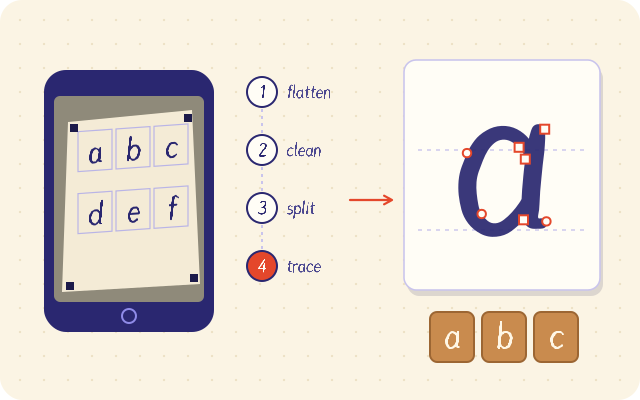
Import your first few letters into the fontsketch editor and check them against the baseline before converting the rest. If your lettering exists only on paper, make a font from your handwriting instead.