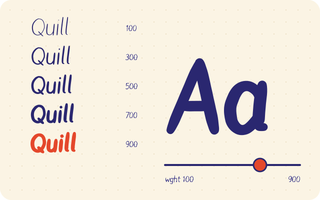
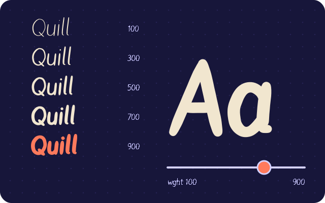
A variable font is one font file that contains a continuous range of styles. To make one with a weight axis, you draw two masters, for example Regular and Bold, with exactly the same point structure, then export them together. The font interpolates between the masters, so CSS can request any weight in the range, such as 450 or 620.
How interpolation works
Think of each point in a glyph as having two positions: one in the Regular master and one in the Bold master. A variable font stores the Regular outline plus, for every point, how far it moves to reach the Bold position. At weight 550, halfway between 400 and 700, each point sits halfway along its path.
That simple idea explains the main rule: the masters must be point compatible. The font can only move points that exist in both masters. If the Bold n has one more point than the Regular n, there is no way to pair them up.
Compatibility means, for every glyph:
- The same number of contours
- The same number of points in each contour
- The same order of contours
- The same start point on each contour
- The same point types, so a smooth point stays smooth and a corner stays a corner
- The same contour direction
Step 1: finish the Regular master completely
The most reliable workflow is to fully finish one master before starting the other. Draw or import every glyph, then:
- Run simplify and curve fitting so the point count is final
- Run overlap removal so each letter has its final contour structure
- Run contour direction correction
Do these operations before creating the second master. If you simplify the Bold master later, the algorithm may remove different points than it did in the Regular, and compatibility breaks.
If you are new to drawing a font, finish and test the Regular on its own first and come back once it is solid.
Step 2: create the Bold master from a copy
Start the Bold master as a duplicate of the Regular. Now every glyph is compatible by definition. Your job is to make it heavier only by moving existing points and handles.
Practical tips for drawing weight:
- Stems grow mostly outward. When a stem gets thicker, move both sides, but also widen the glyph so counters do not close up.
- Counters shrink, but must not vanish. The inside of e, a and s fills up quickly. Keep enough white space for the bold weight to stay readable.
- Horizontals grow less than verticals. Crossbars and the tops of arches gain less weight, or the letter becomes a blob.
- Joins get notches. Where an arch meets a stem in n, m or h, bold weights often need the join thinned to stay open.
- Spacing changes. Bold glyphs are usually wider, and their side bearings may need adjusting so text keeps an even rhythm.
Step 3: check compatibility before export
Go through the glyphs and compare masters. Watch especially for:
- Letters you redrew from scratch in one master
- Accented letters, which are fine if they come from components in both masters
- Glyphs where overlap removal was run in one master only
- Contours whose start point moved
A good final check is to export a test build and set text at weight 550 in a browser page. If a glyph twists, flips or develops a loop at 550, the start point or point order differs between masters.
Step 4: choose the axis range
The wght axis uses the standard CSS weight scale:
| Value | Common name |
|---|---|
| 100 | Thin |
| 300 | Light |
| 400 | Regular |
| 500 | Medium |
| 600 | Semibold |
| 700 | Bold |
| 900 | Black |
With a Regular and a Bold master, your font covers 400 to 700. Everything in between comes from interpolation, so Medium and Semibold are free. If you want the range to reach Light, you need a Light master as well; extrapolating beyond the masters is not part of the format.
Step 5: export one variable font file
Export with the variable option enabled. fontsketch writes one font with a wght axis built from your masters. WOFF2 is the best choice for the web, and TTF works for desktop apps that support variable fonts.
From Node, the same option exists in the API:
import { writeFile } from 'node:fs/promises';
import { exportFont } from 'fontsketch';

// font is a project with Regular and Bold masters
const bytes = exportFont(font, { format: 'woff2', variable: true });
await writeFile('MySans-VF.woff2', bytes);
Step 6: use the variable font in CSS
Declare the weight range in @font-face so the browser knows the file covers it:
@font-face {
  font-family: "MySans";
  src: url("/fonts/MySans-VF.woff2") format("woff2-variations"),
       url("/fonts/MySans-VF.woff2") format("woff2");
  font-weight: 400 700;
  font-display: swap;
}

body { font-family: "MySans", system-ui, sans-serif; font-weight: 400; }
h1 { font-weight: 680; }
strong { font-weight: 600; }
Use font-weight for the wght axis. It cascades properly, works with bold and bolder, and the browser never fakes a bold when the weight is inside the declared range. Reserve font-variation-settings for custom axes, because it overrides inheritance in ways that are easy to get wrong:
/* Works, but prefer font-weight for wght */
.special { font-variation-settings: "wght" 550; }
Variable weights can also be animated with a CSS transition on font-weight, which is useful for hover states. Use it sparingly, since changing weight changes width and can shift layout.
For more on loading the file efficiently, read using your font on a website.
Providing a fallback for older browsers
Almost every browser in use today understands variable fonts, but a defensive setup costs little. Keep a sensible system font later in the font-family stack so that if the variable file fails to load, the page stays readable. If you must support a specific old environment, you can also export static Regular and Bold files from the same masters and declare them in separate @font-face rules inside an @supports not (font-variation-settings: normal) block. For most sites this is unnecessary.
When a variable font is worth it
A variable font pays off when a design uses three or more weights, or when you want fine control such as a heading weight of 650 that no static file offers. If your site only ever uses Regular and Bold, two small static files can be lighter than one variable file. Measure both before deciding.
Hinting and variable fonts
Variable fonts are mostly used on high resolution screens where hinting matters less, but small UI text on Windows can still benefit. Test the exported font at 12 to 16 px at several weights. The export dialog offers automatic hinting, manual stems or none.
Variable font checklist
- Regular master finished, simplified, overlaps removed, directions corrected
- Bold master created as a copy, edited only by moving points
- Every glyph checked for matching contours, points, order and start points
- Test build checked at an intermediate weight for twists or loops
- Spacing reviewed at both ends and in the middle of the range
- @font-face declares font-weight 400 700
Next steps
Open the fontsketch editor, finish your Regular master, and duplicate it to start the Bold. Begin with n, o and H in bold before touching the rest.