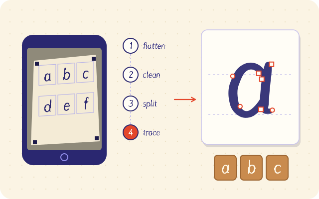
Making a font from your handwriting takes about half an hour: print a template sheet, fill each cell with one letter, photograph it with your phone, and let fontsketch trace every character into vector outlines. You then fix spacing, add a few kerning pairs and export a TTF, OTF or WOFF2 file, all inside your browser.
What you need before you start
The good news is that the equipment list is short. Most people already have everything.
- A printer, or access to one, for a single A4 or Letter page
- A pen with dark, consistent ink (a 0.5 to 0.8 mm felt tip is ideal)
- A phone camera or a flatbed scanner
- A modern desktop browser to run the fontsketch editor
There is nothing to install and no account to create. The editor runs entirely in your browser, the photo is processed on your device, and your project autosaves locally so you can close the tab and come back later.
Step 1: print the handwriting template
In fontsketch, open the handwriting sheet option and download the PDF template in A4 or Letter. Print it at 100 percent scale. If your print dialog shrinks the page with an option like fit to page, the cells still work, but the markers will be closer together than expected and you lose a little resolution for nothing.
Each sheet has a grid of cells, one per character, plus four solid corner markers. Those markers matter: they are how the software finds the page in a photo and straightens it.
Step 2: write your characters
This is the part that decides how the font will look, so take your time.
- Write at your natural size. Fill roughly two thirds of the cell height for capitals. Tiny letters lose detail when traced, and letters that touch the border get clipped.
- Keep a steady baseline. Imagine a line about a third of the way up each cell and sit every letter on it, letting descenders on g, j, p, q and y drop below.
- Match your x-height. Lowercase letters like a, n and o should reach roughly the same height across all cells, otherwise words will bounce.
- Do not go back over strokes. Retouching a line usually makes it thicker and lumpier than the rest. If you make a mistake, print a fresh sheet or redo that letter later in the editor.
If you want the font to feel natural, write the letters as you would inside a word, not in your neatest school print.
Step 3: photograph or scan the sheet
A phone photo is enough. Lay the page flat on a table near a window, avoid direct sun, and hold the phone roughly parallel to the paper so your own shadow does not fall across the grid. All four corner markers must be inside the frame. Fill as much of the frame with the page as you can, because more pixels per letter means smoother outlines.
If you have a flatbed scanner, scan in grayscale at 300 dpi. Scans give the cleanest edges, but they are not required.
Step 4: let fontsketch trace the letters
Drop the image into the editor. fontsketch then runs a short pipeline, all locally:
- It finds the four corner markers and corrects perspective, so a slightly tilted photo becomes a flat page.
- It evens out the lighting, which removes the gradient you get from a window on one side.
- It binarizes the image into pure black ink on white paper.
- It splits the grid into individual cells and maps each one to its character.
- It traces each letter into vector outlines and gives every glyph a confidence score.
The confidence score is your review list. A high score means the trace found a clean, single shape where it expected one. A low score usually points to a stray mark, a letter touching the cell border, or a faint stroke that broke apart.
Step 5: clean up the glyphs
Start with the glyphs that have the lowest confidence scores. Typical fixes:
- Delete specks and smudges that were traced as tiny contours.
- Run simplify to reduce the number of points. Traced outlines often have far more nodes than needed, which makes curves wobbly. Simplifying with curve fitting gives smoother shapes and smaller files.
- Use overlap removal on letters where strokes cross, such as t, f or x, so the outline is a single clean shape.
- Let fontsketch correct contour direction, which keeps counters (the holes in o, e, a) rendering correctly.
If a letter just does not look right, redraw it with the brush or the bezier pen tool. Mixing a few hand drawn glyphs with traced ones is normal and nobody will notice.
Step 6: metrics, spacing and accents
Fonts use a coordinate system called units per em, and fontsketch uses 1000 units. Check the metrics: the ascender, descender, x-height and cap height lines should match your writing. If your lowercase looks too small next to your capitals, this is where you fix it.
Spacing is what makes a handwriting font look professional instead of homemade. Each glyph has a left and right side bearing, the empty space on each side. Set them so the gaps inside words look even. A good test string is nonononon and HOHOHOH: if the rhythm looks regular, your base spacing is right.
Next, add kerning pairs for combinations that still look off, such as T next to o or A next to V. Start with pairs like To, Ty, AV and Wa.
Accented letters are mostly automatic. Draw or trace the marks (acute, grave, circumflex, tilde, diaeresis, cedilla, ring) and fontsketch composes letters like ã, é, ç and ü from base plus mark components, covering Latin-1 Supplement and Latin Extended-A. That is enough for Portuguese, Spanish, French, German, Polish and many other languages.
Step 7: export the font
Pick the format that matches where you will use it:
| Use | Format |
|---|---|
| Install on Windows or macOS, use in Word or design apps | TTF or OTF |
| Website or web app | WOFF2 plus the CSS @font-face snippet |
| Older systems that need a fallback | WOFF |
Automatic TrueType hinting is available on export and helps your font stay crisp at small sizes on Windows screens. Handwriting fonts are usually used at larger sizes, so this matters less than for a body text font, but it does no harm.
To put the font on a site, follow use a custom font on your website.
Common mistakes to avoid
- Writing with a ballpoint pen. The line is thin and uneven, so traces come out ragged.
- Photographing at an angle in dim light. Perspective correction is good, but heavy shadows still eat into strokes.
- Skipping punctuation. A font without period, comma, apostrophe and question mark is frustrating to use.
- Ignoring spacing. Even beautiful letters look clumsy with uneven gaps.
Quick checklist
- Template printed at 100 percent scale
- Every cell filled, letters inside the borders
- Photo taken in even light with all four markers visible
- Low confidence glyphs reviewed and fixed
- Spacing tested with nonononon and HOHOHOH
- Marks drawn so accented letters build automatically
- Exported in the right format for your use
Next steps
Open the fontsketch editor and print your first sheet. Once your font works, save a .fontsketch.json project file so you can come back and add more characters later.